
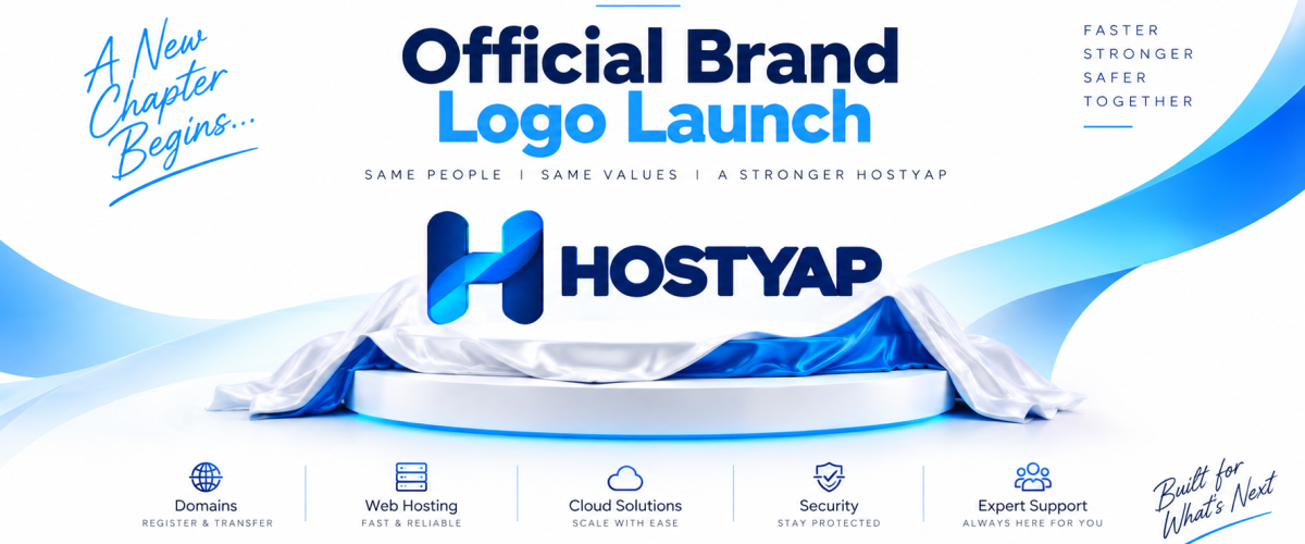
HOSTYAP has a new look. Our commitment remains the same.
Today, we’re excited to introduce the refreshed HOSTYAP brand identity—a new logo designed to better represent who we are today and where we’re heading next.
Since HOSTYAP began, our goal has been straightforward: make domains, web hosting and online infrastructure easier, faster and more dependable for our customers. As our services and community have grown, we felt it was time for our visual identity to grow with us.
Our previous logo has been an important part of the HOSTYAP journey. It represented the company through an important stage of our development, and we’re proud of what it stood for.
But HOSTYAP today is evolving into a more mature, technology-focused hosting platform. Our new identity reflects that evolution.
Meet the New HOSTYAP Logo
At the heart of our new identity is a completely redesigned H symbol.
The new mark uses two strong vertical forms connected by a flowing ribbon. Together, they create a distinctive H that represents HOSTYAP while also suggesting connection, movement and continuous digital infrastructure.
The overlapping ribbon gives the symbol a sense of forward motion. It’s a visual expression of what we want HOSTYAP to provide every day: technology that connects smoothly, performs reliably and helps businesses move forward.
Beside the symbol is a simpler, stronger HOSTYAP wordmark, designed to remain clear and recognizable across everything from a website header to a server dashboard, mobile interface, social media profile or printed material.
A More Focused Color System
Our previous identity used several different colors. The refreshed HOSTYAP brand moves toward a much more focused technology palette built around three core colors:
- HOSTYAP Navy — #1C3160: trust, stability and infrastructure
- Deep Navy — #0F1E3D: strength, security and reliability
- HOSTYAP Cyan — #39B2E6: speed, connectivity and modern technology
The H symbol brings these tones together through carefully layered blue gradients, giving the mark depth while keeping the overall identity clean and recognizable.
The result is a visual system that feels more consistent with the company HOSTYAP is becoming.
Why We Rebranded
This isn’t a change made simply for the sake of having a different logo.
HOSTYAP is expanding beyond the idea of being just another web-hosting website. Our ecosystem covers the services businesses and individuals need to build and operate online—from domain registration and transfers to shared hosting, WordPress hosting, reseller hosting, VPS and cloud solutions, dedicated hosting, SSL and other web services.
As that ecosystem grows, we need an identity capable of representing all of it.
The new HOSTYAP brand has therefore been designed to work as a complete system. The H can stand independently as our icon, while the full HOSTYAP lockup provides strong brand recognition wherever more space is available.
It also gives us a consistent foundation for our website, customer area, hosting products, documentation, support experience, social channels and future services.
From the Old HOSTYAP to the New HOSTYAP
Our old logo was colorful, energetic and part of our history. We aren’t trying to erase that history.
Instead, the new identity takes HOSTYAP into its next stage.
The visual change represents a move from a more traditional hosting-company identity toward something simpler, more focused and more distinctly HOSTYAP.
The new H is intended to become an instantly recognizable symbol of the brand—even when the HOSTYAP name isn’t sitting beside it.
As we roll out the new identity, you may see both versions in a few places while websites, systems, documents and other materials are updated.
What Isn’t Changing
Although our appearance is changing, the principles behind HOSTYAP aren’t.
We remain focused on reliable infrastructure, fast hosting, straightforward services, responsive support and making it easier for our customers to build and grow online.
Existing customers don’t need to take any action because of the rebrand. Your HOSTYAP services, account and products continue as usual.
This is a visual evolution—not a change to the relationship we’ve built with our customers.
Built for What’s Next
A brand identity should represent more than where a company has been. It should be ready for where the company is going.
That’s what this new identity means to us.
The new HOSTYAP H is designed to become a common thread across our entire ecosystem—from the first domain someone registers with us to the infrastructure powering their websites and businesses years later.
New identity. Same HOSTYAP. Built for what’s next.
Welcome to the next chapter of HOSTYAP.
